The logos of brands such as Ferrari, Toyota or Mercedes are known all over the world. We tell you the story behind them and the ideas that led to its emblematic creation in the motor world.
All the logos of car brands have a story behind them. As you can imagine, some are much more interesting than others. Not all car logos are inspiring, but there are some arising from very motivating stories. So much that it makes you want to take the model in question and go to a road of curves to enjoy it while listening to your favorite song. This is our selection of the five most mythical car logos.
Ford Mustang
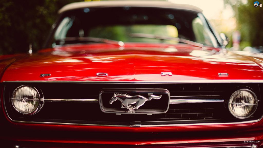
It has been more than 50 years since the Ford Mustang carried a horse on its front. Why? Because the Mustang itself is a horse race that disappeared from North America back in the Pleistocene and was reintroduced by the Spanish conquerors in the sixteenth century. It is a type of animal native to southern Europe and northern Africa. But Mustang is also a North American warplane. However, the creators preferred the symbol to be a horse. After all, this pony car is a pureblood, is not it?
Ferrari
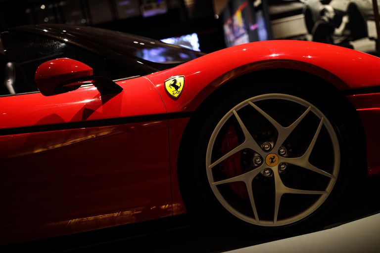
The Ferrari logo also features a runaway horse as the main symbol. However, although it may seem simple, it is more elaborate than the Mustang. It has a yellow background that represents the color of the Modena region, and proudly displays the flag of Italy on the highest part. In addition, under the horse, you can read the letters S and F, from Scuderia Ferrari. Finally, the origin of the horse comes from a fighter plane driven by a friend of Enzo Ferrari in the First World War.
Alfa Romeo
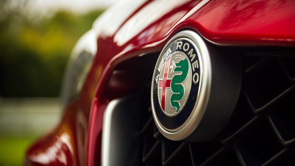
There are rocambolescas stories and gimmicky, and then there is the logo of Alfa Romeo. The symbol of the signature of the Biscione comes from one of the hallmarks of Milan, the Red Cross on the left, and is surrounded by a circle in which the name of the Italian brand is read. But the green snake with a crown that you see on the right is a symbol of the Casa Visconti. It is a family of nobles who ruled the city of Milan. The most surprising thing is that what you see in your mouth is not a language, but a Muslim man you are eating.
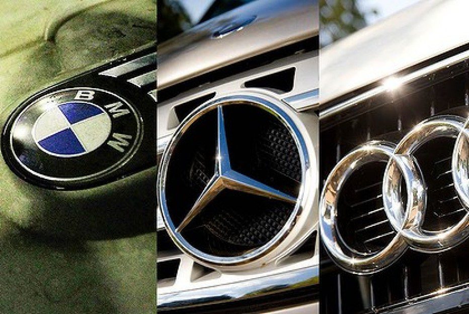
Mercedes

The creation of the Mercedes logo is epic in itself. The three-pointed star of the German firm has an origin that attends to the greatness of the manufacturer. At the beginning of the last century, Daimler not only manufactured cars but also did the same with airplanes and boats. Well, each of the three points of the star is responsible for representing the three areas in which Mercedes was present: land, sea, and air. A symbol of power that was endorsed with the crown of laurels that was added a posteriori as a result of their successes in competition.
Toyota
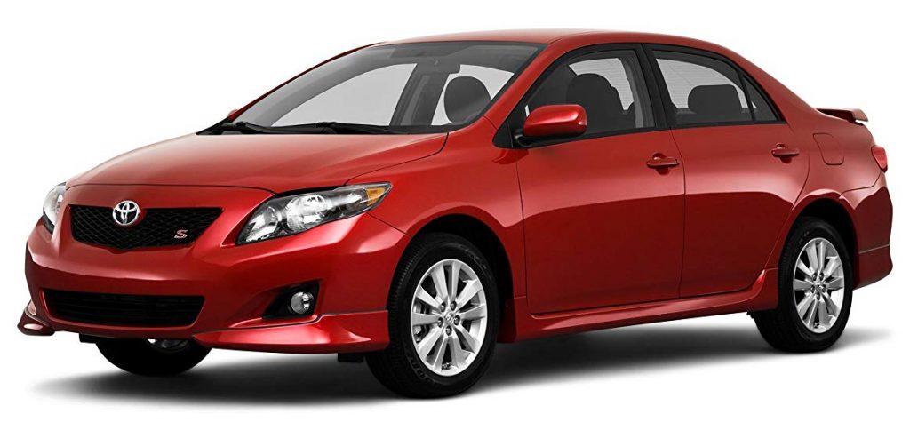
It is likely that, at first, the Toyota logo seems simpler than the mechanism of eating a mixed sandwich. However, behind that apparently bland and unfounded symbol are hidden reasons of the most curious. You should know that Toyota comes from the surname of the founder, Toyoda, but changing the’d’ for a ‘t’ due to the better sound. Also, ‘toyo’ in Japanese means abundance, and ‘ta’, rice. And anyone who has rice in large quantities is considered rich. On the other hand, the three ellipses represent the heart of the customer, the heart of the product (they are the two that form the ‘T’) and the desire for infinite expansion.